BRAND RESOURCE CENTER
The definitive reference for how Sapphire looks, sounds, and presents itself across every surface. For the internal Sapphire team and authorized partners.
Mission & Vision
The load-bearing brand statements. Mission defines what Sapphire does. Vision defines where Sapphire is going. Values define how Sapphire makes decisions.
Mission
Sapphire designs and builds turnkey luxury homes in Southeast Michigan — fully integrated under one roof, fully complete at key exchange.
That sentence carries three commitments. Turnkey is the promise. Fully integrated under one roof is the operating model. Fully complete at key exchange is the bar.
Vision
To be the new standard of luxury home building — where every decision is made before a shovel hits the ground, and every home is move-in ready on day one.
Sapphire is not trying to be the biggest. Sapphire is trying to redefine what "luxury custom home" should mean. The long-term ambition: 3x33 — three markets by 2033.
The Five Values
Logo System
The following are the only official Sapphire logos. No other marks, lockups, or variations should be used. The logo is always rendered in black or white. No gold variant exists.
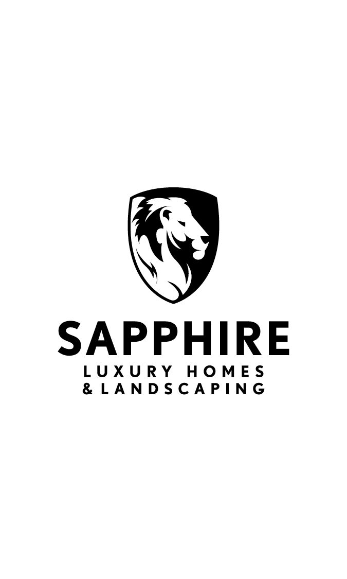
Full Logo — Sapphire Luxury Homes & Landscaping
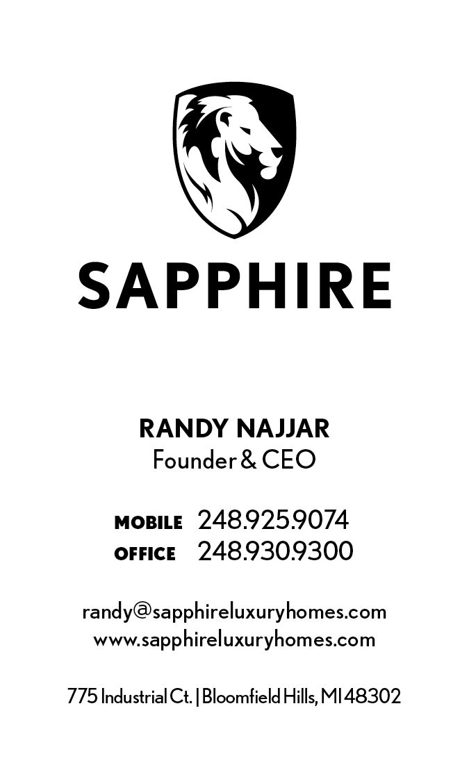
The full logo includes the lion crest with "Sapphire Luxury Homes & Landscaping" as the wordmark. Use it in any context where the logo does not have surrounding context, or in formal applications: email signatures, print ads, business cards, proposals, signage, and first impressions.
Horizontal
Vertical
Short Logo — Sapphire
The short logo uses the lion crest with "Sapphire" only. Use it when surrounding context makes the full company name clear — interior pages of a deck, web headers, social media avatars, secondary placements, and anywhere simplicity is key.
Horizontal
Vertical
The Lion Crest — Standalone
The lion-and-shield crest is the heart of the Sapphire mark. It can be used alone when the Sapphire brand has already been established in context. The long-term goal: the lion alone should be recognizable as Sapphire.
Logo Usage Rules
Consistency builds recognition. These rules apply to every application of the Sapphire logo.
When to Use Which Logo
Use in formal applications and first impressions: email signatures, print advertising, business cards, proposals, contracts, signage, vehicle wraps, and any placement where the viewer may not already know the brand.
Use when context is clear and simplicity matters: interior pages of a presentation, website headers, social media avatars, secondary placements on collateral, and repeat appearances within the same document.
Use when the Sapphire brand has already been established in context: favicon, watermark, branded merchandise for the team, and secondary accent within a Sapphire-branded piece.
Clear Space
Always maintain clear space around the logo equal to at least half the height of the lion mark. No text, imagery, or other elements should encroach on this boundary.
Minimum Size
Establishing a minimum size ensures legibility is never compromised.
| Logo | Digital Minimum | Print Minimum |
|---|---|---|
| Full logo (horizontal) | 120px width | 35mm width |
| Full logo (vertical) | 80px width | 25mm width |
| Short logo (horizontal) | 100px width | 30mm width |
| Short logo (vertical) | 60px width | 20mm width |
| Lion crest alone | 24px width | 8mm width |
The Lion Mark — Never Invert
The lion crest has a built-in white border around the shield. On dark backgrounds, the white border provides contrast while the black fill disappears. On light backgrounds, the white border disappears while the black fill provides contrast. The same file works on any background — never create an inverted, outlined, or recolored version.
Color Variants
White logo on dark backgrounds. Black logo on light backgrounds.
Never create a gold logo variant. The lion mark and wordmark are always black or white.
Logo Misuse
Do not recolor the logo. It is always black or white.
Do not rotate, skew, or distort the logo.
Do not stretch or alter the proportions.
Do not reduce opacity or place where legibility is compromised.
Company Name Usage
"Sapphire Luxury Homes & Landscaping" for formal documents, legal text, and footers.
"Sapphire" alone in body copy where context is clear.
Never use "Sapphire Homes" or "Sapphire Luxury Homes" without "& Landscaping."
Color Palette
Sapphire's palette is deliberately restrained. Black and white dominate. Gold is an accent only — never a background, never a logo color.
Primary Palette
CMYK 0/0/0/100
RGB 0, 0, 0
CMYK 0/0/0/0
RGB 255, 255, 255
CMYK 35/35/75/5
RGB 180, 155, 92
Usage Rules
Dark backgrounds with white type for hero sections, cover pages, and section dividers.
White backgrounds with black type for body content and readability sections.
Gold as an accent — section numbers (01, 02, 03), a highlighted word in a title, eyebrow tags, small dividers, and the tagline accent.
Never use gold as a background for body content or as a logo fill.
Never invent new colors. Sample from sapphireluxuryhomes.com when extending into new collateral.
The Gold
Sapphire Gold is muted and warm — closer to antique gold or aged brass than bright metallic gold. Never saturated. Never shiny. A quiet signal of quality.
Approximate ratio: black and white dominate. Gold is the rare highlight.
Typography
Sapphire uses two typefaces. Nobel for headings and display text. Halyard Display for body copy. Nobel is available in three weights: Light, Regular, and Bold — plus their italic variants. No other weights or condensed variants are used.
Nobel — The Sapphire Font
Designed by Tobias Frere-Jones. Nobel is used in ALL CAPS for headings and display text, and in standard case for body copy in print. On the web, body copy uses Halyard Display.
SAPPHIRE
SAPPHIRE
SAPPHIRE
Approved Weights
BUILDING DREAMS
BUILDING DREAMS
BUILDING DREAMS
BUILDING DREAMS
BUILDING DREAMS
BUILDING DREAMS
Halyard Display — The Body Font
Halyard Display is used for all body copy, paragraphs, and running text on the web and in digital applications. It pairs with Nobel headings to create clear visual hierarchy — Nobel commands attention, Halyard delivers the content.
Your home is fully finished, furnished, and ready to live in the day you receive the keys. No follow-up contractors. No loose ends. Just the keys. A 26-person in-house team delivering 10 to 12 custom homes per year in the $3M to $10M range.
Use Halyard Display for all body copy, descriptions, paragraphs, and running text in digital and web contexts.
Use Nobel in standard case for body copy in print materials where Halyard is not available.
Never use Halyard Display for headings, labels, or display text. Those are Nobel.
Type Hierarchy
Never set paragraphs of body copy in ALL CAPS. All caps is for headings and labels only.
Never use Bold for large display headings. Bold is for small utility text only (contact info, fine print, footer details).
Download Fonts
Install all six approved Nobel font files (Light, Light Italic, Regular, Regular Italic, Bold, Bold Italic) and the Halyard Display Regular font from the fonts folder.
Stylistic Headers
Sapphire uses three headline treatments. In all cases, the color of the primary text (black or white) depends on the background brightness. The accent word is always Sapphire Gold.
Compound Header — Two Words, No Space
Two words set in all caps with no space between them. The first word is white (on dark) or black (on light). The second word is Sapphire Gold.
Stacked Header — Two Lines, Minimal Line Height
Two words or phrases stacked vertically with minimal line height. The top line is white (on dark) or black (on light). The bottom line is Sapphire Gold.
Subheading — Final Word in Gold Italic
An all-caps subheading where the final word is set in Sapphire Gold and italic. The rest is white (on dark) or black (on light).
Rules
Use Nobel Light for large display headers. Nobel Regular for smaller headers where more weight is needed.
Keep the gold word as the second element — the payoff, the emphasis, the closer.
Never use gold on the first word or the majority of the text. Gold is the accent, not the base.
Never mix these header treatments with decorative flourishes, drop shadows, or outlines.
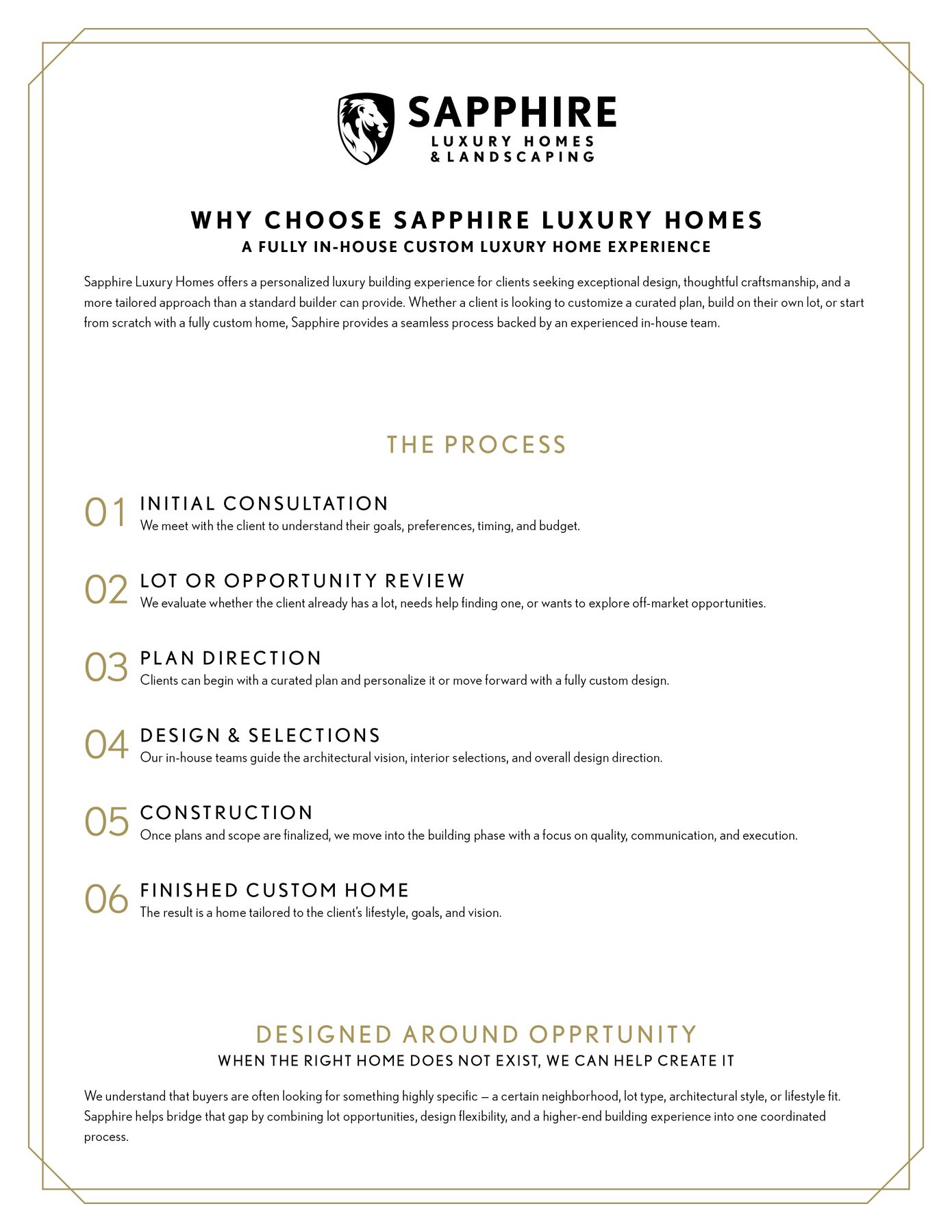
The Numbered Lockup
The numbered lockup is Sapphire's signature visual device. Large gold numbers (01, 02, 03) with an uppercase label and body copy. Use it instead of generic icons for steps, lists, features, and process flows.
Rules
Two-digit numbers with a leading zero (01, 02, 03). Set in Nobel, large, in Sapphire Gold.
Pair the number with an uppercase label and one or two sentences of body copy.
Never replace the numbered lockup with generic icons (compass, house, key, wrench). The numbers are the Sapphire device.
Voice & Messaging
Sapphire sounds like a confident professional who has done this thousands of times and doesn't need to convince you. Not a salesperson. Not a luxury magazine. A confident professional.
The Four Voice Pillars
Copy Examples
Homepage Hero
Social Caption
Canonical Phrases — Use These Exactly
| Topic | Canonical Phrase |
|---|---|
| Integration | Everything under one roof. No coordinating between separate firms, no gaps, no handoffs. |
| Turnkey | Your home is fully finished, furnished, and ready to live in the day you receive the keys. |
| Continued Care | Our commitment doesn't end at closing. |
| Landscape | Designed as part of the home — not after. |
| Process | Clear vision. Perfect execution. |
| Approach | Collaborative. Guided. Intentional. |
| Change Orders | No surprises. We won't do anything until you've been able to review and sign off. |
| Luxury | We believe luxury should be effortless. |
Preferred Words
Banned Words
Format Conventions
Use numerals for specifics: 5,000 sq ft, 18 months, 26-person team, $4M to $5M.
Use "Sapphire" alone in body copy. "Sapphire Luxury Homes & Landscaping" for formal documents.
No exclamation points in marketing copy. Sapphire does not shout.
No emoji in formal writing. Acceptable sparingly in Instagram captions only.
Appears in email signatures, website footer, the Sapphire Journey deck, and internal collateral.
Photography & Renders
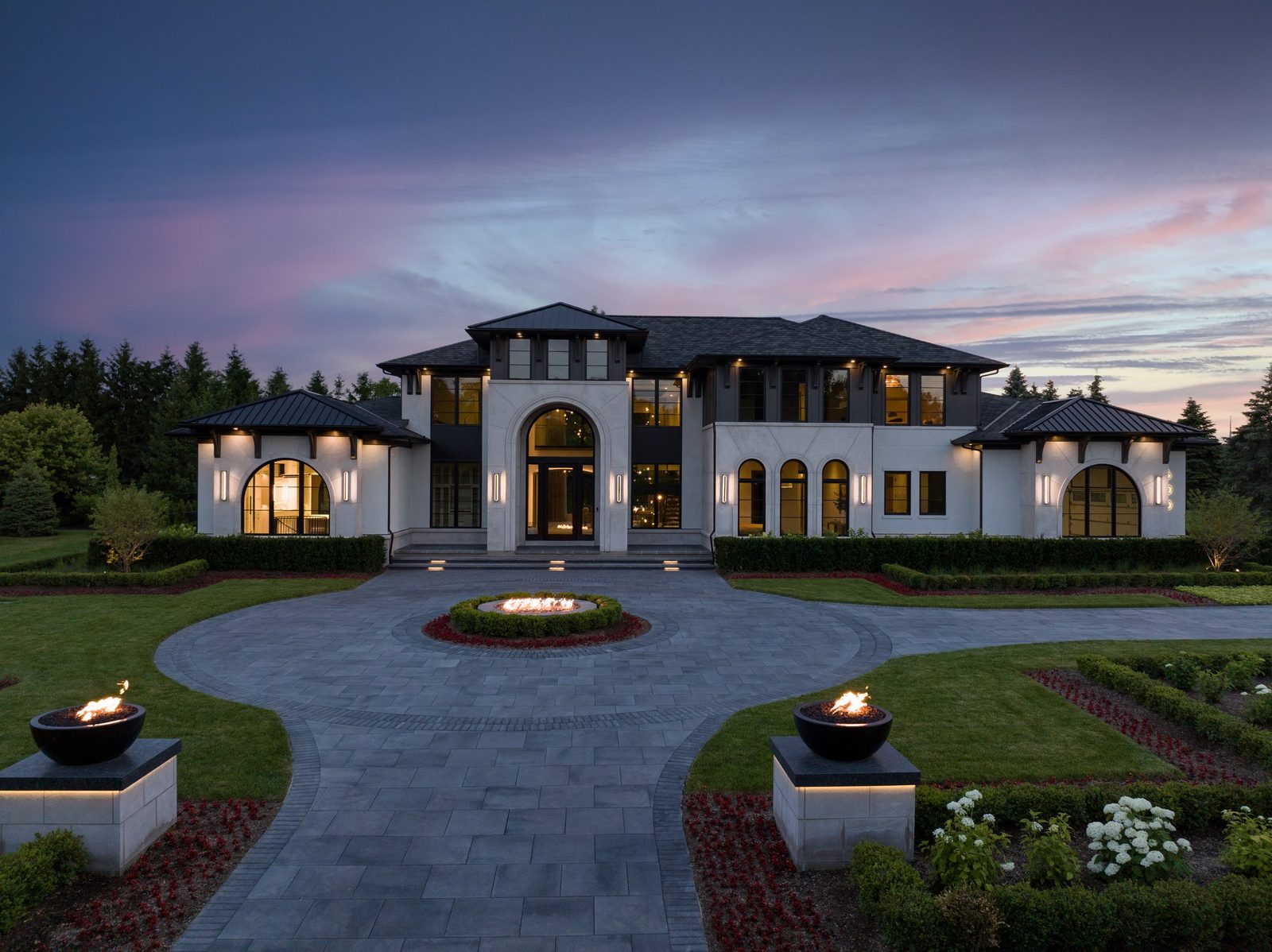
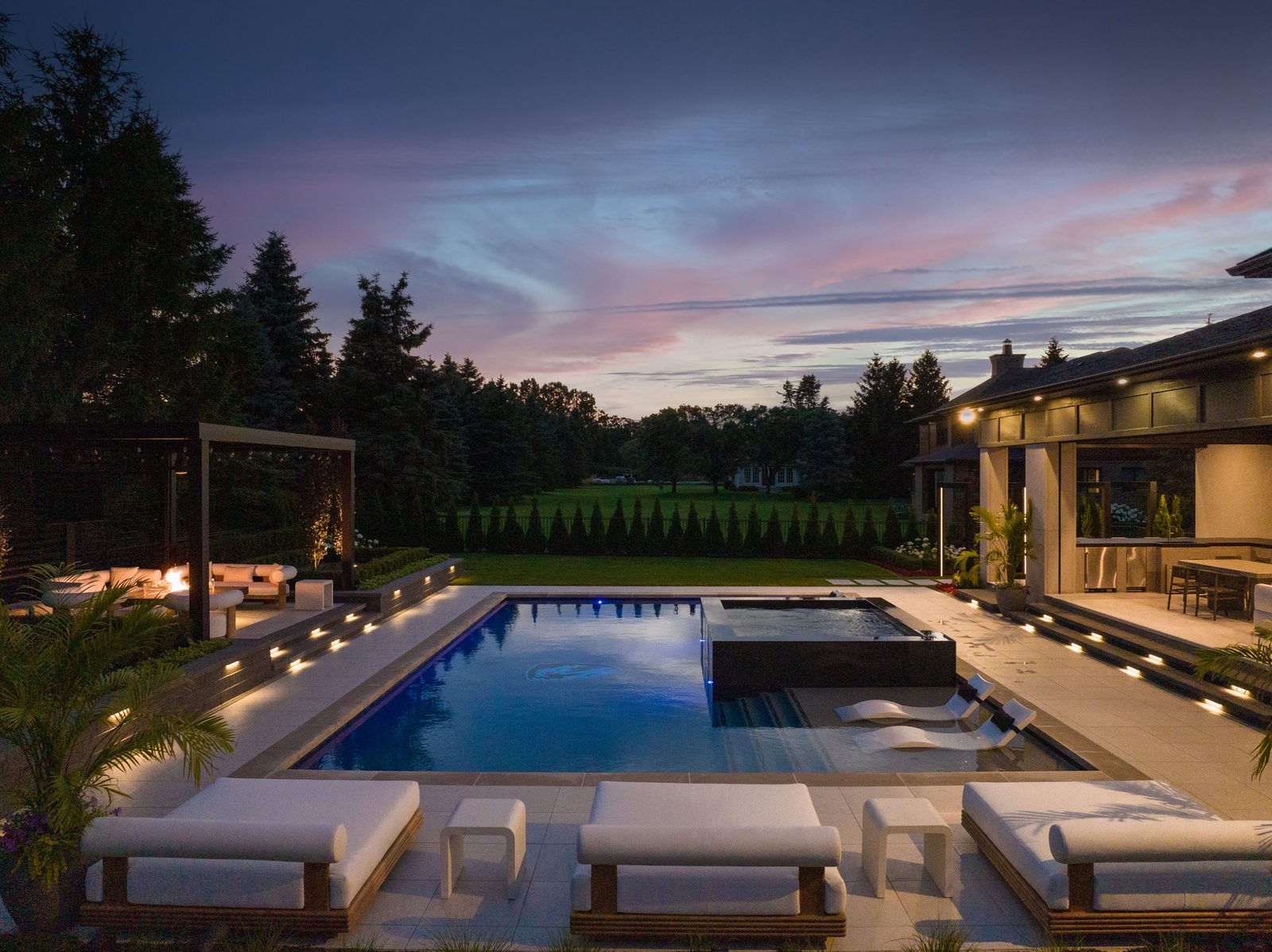
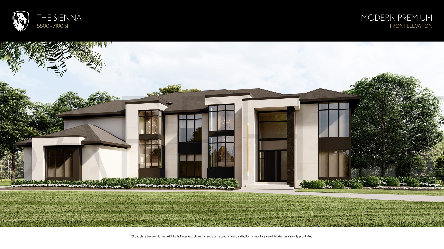
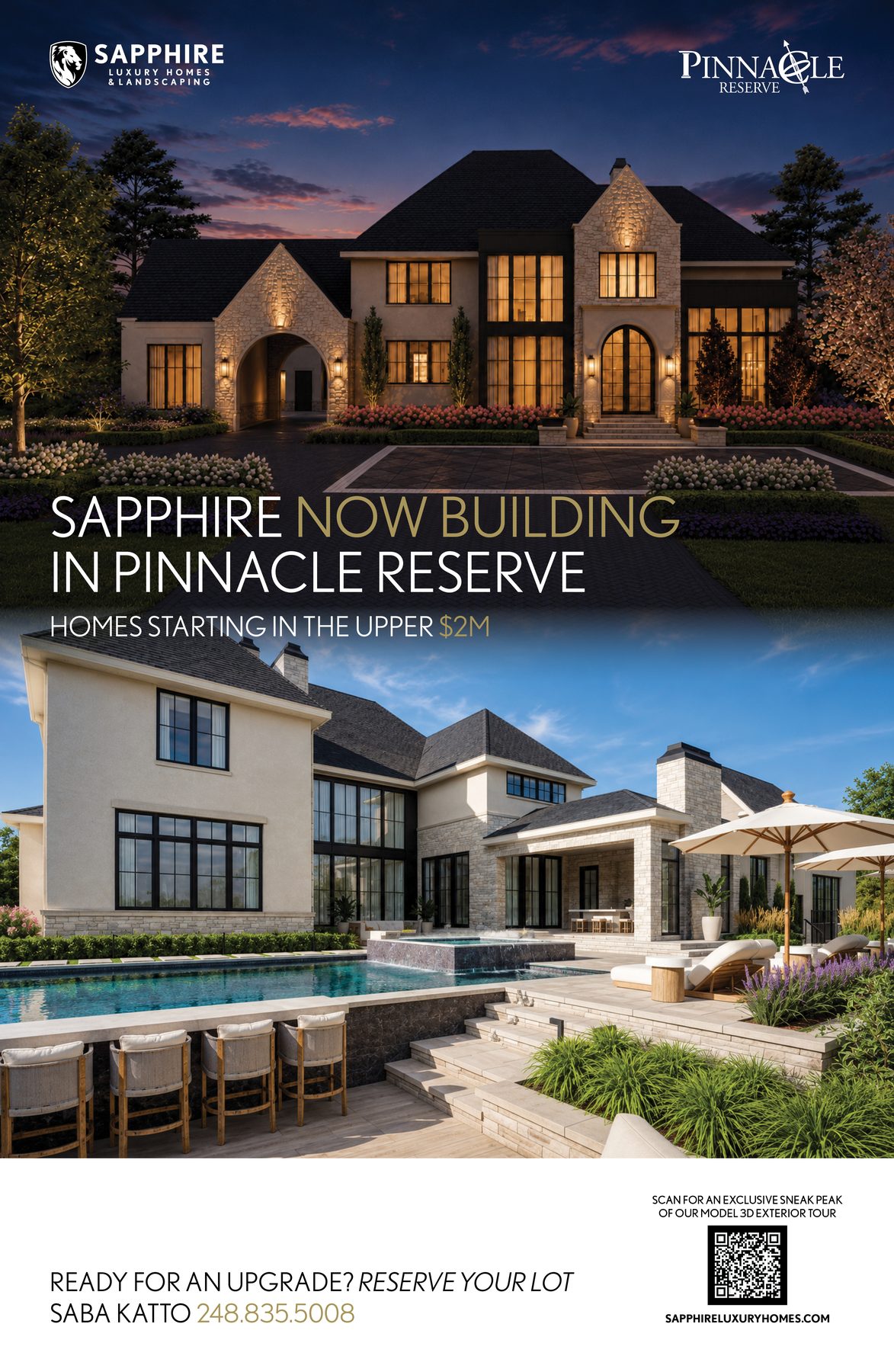
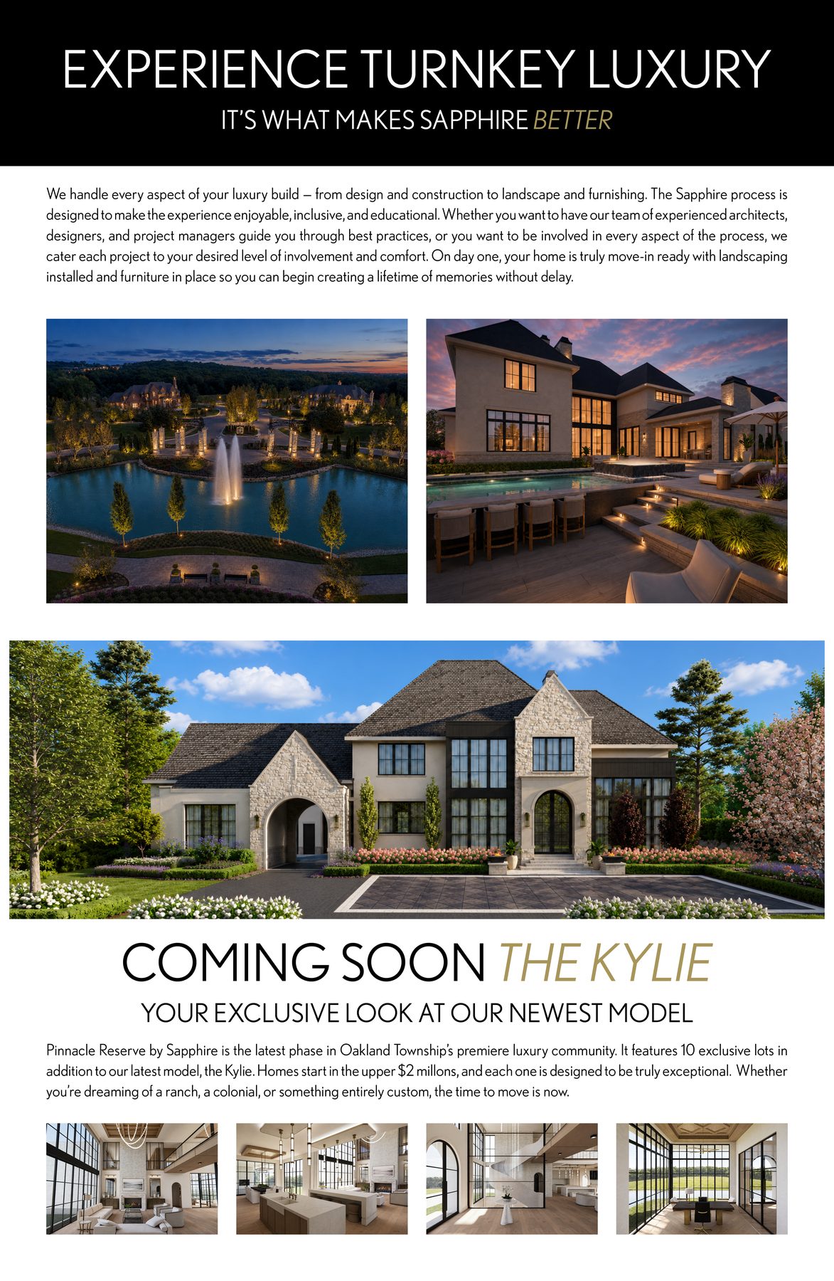
Every photograph in Sapphire marketing must be a real Sapphire home. The home is the hero.
Example Photography
Style Guidelines
What to Avoid
Never use generic stock photography. Always use real Sapphire homes.
No heavy filters or color grading that distorts natural color.
No over-saturated greens in landscape photography.
No luxury cliche close-ups (champagne, watches). Sapphire is about the home.
No identifiable people in marketing photography without explicit permission.
Approved Renders
Sapphire-approved 3D renders may be used alongside or in place of photography for digital and print designs. Renders must accurately represent Sapphire architectural style, use natural lighting and realistic materials, and meet the same editorial standards as photography.
.png)
.png)
Common Mistakes
These are the most frequent brand violations. When in doubt, open the Sapphire Journey deck — that is the visual system.
Create a gold logo. No gold variant of the lion mark or wordmark exists.
Use old brand names. "Sapphire Luxury Homes" (without "& Landscaping") and "Sapphire Landscaping" (standalone) are no longer valid.
Use generic icons. Compass, house, key, wrench — not Sapphire. Use the numbered lockup (01, 02, 03).
Use stock photography. Every image must be a real Sapphire home or team member.
Use banned words. There is always a more specific, more honest alternative.
Use exclamation points. Confidence does not shout.
Add decorative flourishes. No scrollwork, ornaments, patterns. Surfaces are clean.
Lay text on photos without a dark scrim. Use a dark overlay panel first.
Share private client info. Model homes are public. Custom client homes are private by default.
Design Examples
Approved Sapphire collateral demonstrating the brand system in action.
Print Advertising
Process Documents
Business Cards
Digital & Web
Digital & Print Brochures
AI & Digital Design
Building an app, website, or using AI to generate Sapphire content? Import the brand definition file into your tool to ensure every output stays true to Sapphire guidelines — not just visually, but in voice, mission, and values.
Brand Definition File
The sapphire-brand-definition.json file is a machine-readable version of this entire brand guide. It contains structured data for colors, typography, logo rules, voice pillars, canonical phrases, banned words, photography rules, and layout principles. Feed it into any AI tool, design system, or application as context.
"brand": { "name": "Sapphire Luxury Homes & Landscaping", ... },
"mission": "Sapphire designs and builds turnkey luxury homes...",
"colors": { "primary": [ { "name": "Sapphire Black", "hex": "#000000" }, ... ] },
"typography": { "primaryFont": "Nobel", "approvedWeights": [...] },
"voice": { "pillars": [...], "bannedWords": [...], "canonicalPhrases": {...} },
"logo": { "rules": [...] },
...
}
How to Use
Paste the JSON file contents as context at the start of a conversation. The AI will use the brand rules, voice pillars, banned words, and canonical phrases to generate on-brand content.
Import the JSON into your design system or application to enforce colors, typography, and spacing. Parse the colors, typography, and layout objects programmatically.
Use the color and typography values as CSS custom properties. Reference the voice and layout rules during content creation and QA.
Asset Downloads
All approved brand assets in one place. PNG for digital, PDF for print.